DISCLAIMER:
Please do your own due diligence. I am NOT responsible for your trading decisions.
“History does not always repeat, but sometimes it rhymes.” Mark Twain.
A lot of traders and investors are asking the question: “Is it too early to buy, or should I expect more volatility like we saw during the past few days?”
Sometimes, by looking at the past, we can find some clues as to what might happen during similar situations in the present.
The first chart is that of the S&P index performance during the past 12 months.
Charts compliments of www.stockcharts.com
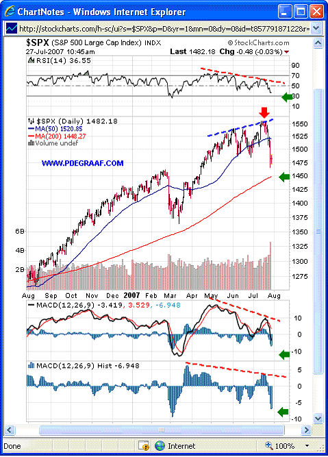
Featured is the S&P daily bar chart. Last week I warned my subscribers (see red arrow), that the S&P and DOW were due for a nasty setback, as the three supporting indicators were flashing warning signs (red dashed lines). The green arrows point to the spots where I now expect this correction to find near-term support.
Let’s take a look next to see what we can learn from a similar situation 20 years ago.
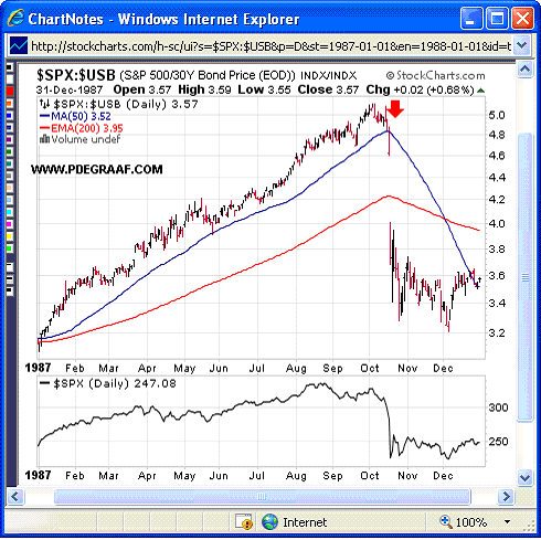
Featured is a chart that compares the 1987 S&P to the 1987 - 30 year bond price ($SPX:$USB), while the 1987 S&P index itself is in the lower box. A good time to buy the DOW is when this ‘combination index’ is near the 200DMA. A good time to sell is when this chart shows a wide divergence from the 200DMA. The red arrow was a warning sign to the stock market “look out below”. The next chart takes a closer look.
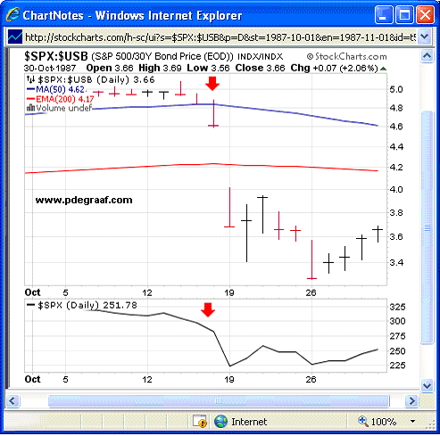
Featured is a close-up of the previous chart. In 1987 those who watched this ‘index combination’ ($SPX:$USB) on a daily basis would have seen on Oct 15 and Oct 16 that it was time to bail out (red arrows), thereby avoiding most of the carnage.
Let’s apply this lesson to today’s chart formation.
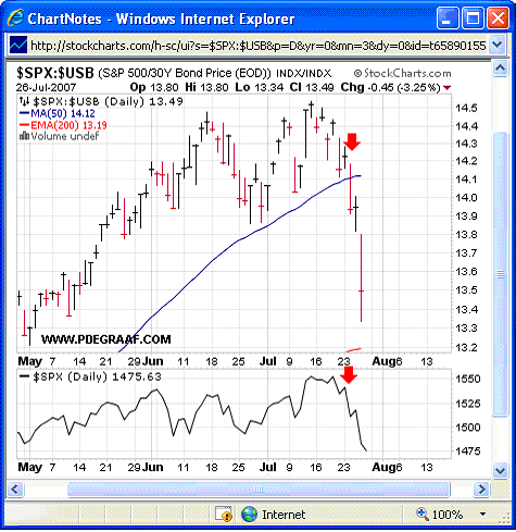
Featured is the 2007 - 3 months chart of the ‘comparison index’ that compares the S&P index to the 30 year bond price (SPX:USB) Although I had been warning my subscribers for weeks that the S&P was overbought, on the 23rd and 24th I was able to issue my sternest warnings yet, (red arrows).
Conclusion: You don’t need me, all you need to do is start using this chart pattern as part of your system. BUY GENERIC STOCKS (DOW, S&P etc.) WHEN THIS COMBINATION INDEX IS NEAR THE 200 DMA, AND SELL WHEN IT GETS TOO FAR ABOVE IT!
Let’s take a look at how gold fared in 1987.
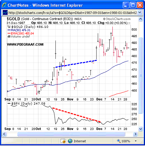
Featured is the chart that compares the 1987 S&P index (bottom) to the 1987 gold price at top). Gold initially rose in price, then dropped. Six weeks later gold was higher (blue dashed line, while the S&P (bottom chart), was still on the floor (red dashed line).
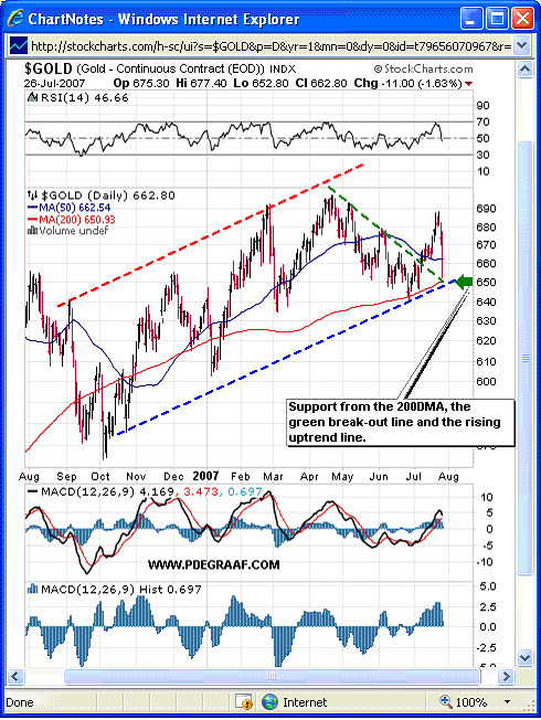
Featured is the current gold price chart. While we don’t know what the future holds, we can determine where the support for gold is at present. Support is indicated at $650., (green arrow), the 50DMA and 200DMA are in positive alignment, and both are rising. That is bullish. The RSI and MACD indicators both have room to move up, along with the gold price.
Some of the damage to the bullish case for gold has been caused by central bank selling during the past few weeks. The positive aspect is that they can only sell it once. In the 1960’s these same central banks (the London Gold Pool), sold tonnes of gold, trying to stop gold from rising above $100./oz. They finally gave up.
Some traders are being spooked by the ’bounce up’ in the US dollar index. The dollar was overdue, especially so close to it’s multi-year support level at 80.00
We should consider ourselves blessed to still be able to buy gold at $650+/oz. Think of those investors in Zimbabwe who have to shell out 3 million Zimbabwean dollars just to buy a gram of gold! Better buy your gold now, for the higher the price goes, the more difficult it will be to obtain the increasing amount of cash that will be required, and the more restrictions the buyer will face. Every year the US Federal government publishes 76,000 pages of new regulations. Some of these regulations will no doubt relate to gold.
We finish this essay with the current XAU, two year, mining stocks chart.
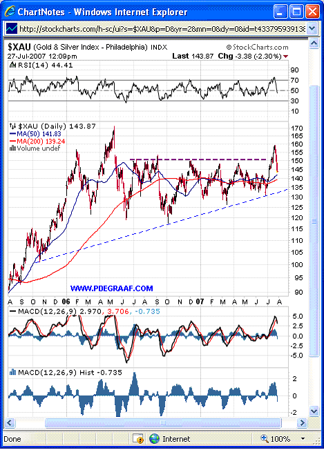
Most breakouts are tested right after the breakout. This one rose from 130 to 160, and has since given back 50%. It is currently just above the support of the 50DMA and 200DMA. These two moving averages are in positive alignment, and both are rising. We should soon be able to spot signs that the bottom is in, and the next rise can then take place.
